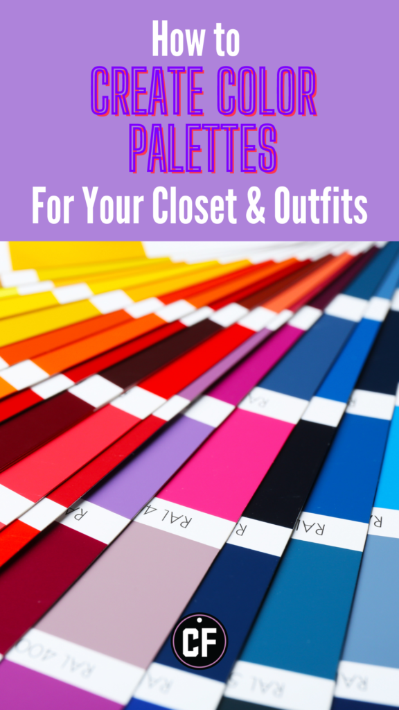
This post will give useful tips to create color palettes for your outfits like a pro.
If there’s a cardinal rule in fashion, it is that neutrals work with everything and are a cohesive color palette no matter what. If you aren’t sure how to wear any given item, go with a neutral.
While many people thrive with an easy-to-match neutral closet, others, like me, don’t. I need color in my life.
However, creating an outfit with a color palette that’s not just neutral can be challenging. And trying to create a cohesive palette throughout your entire closet can be even harder.
This week, I’m sharing my tips for creating a cohesive color palette in your closet and outfits. I promise, you’ll find it easier once you read these tips.
Table of Contents
But what *is* a color palette?
A color palette or scheme is the combined use of two or more colors. Different types of schemes are used for different purposes, be they practical or purely aesthetic.
The most obvious examples of color plates we see in fashion are an achromatic palette (neutrals) like a black-and-white one, a monochromatic palette (one color, different shades or tones), or a primary color palette (red, blue, and yellow).
Note: Go to this CF article for a more in-depth analysis of color theory and color blocking.
But those are very clear-cut, right? If it’s all beige, then it works. If it’s all red, then it goes together. Bright red, yellow, and blue—perfect!
But what about everything in between? How do you know what works with what?
What’s your closet’s color palette, and what is your *ideal* color palette?
First things first, I’ll give you a little guide to know what your *ideal* color palette is, what your closet’s *actual* palette is, and how to combine both.
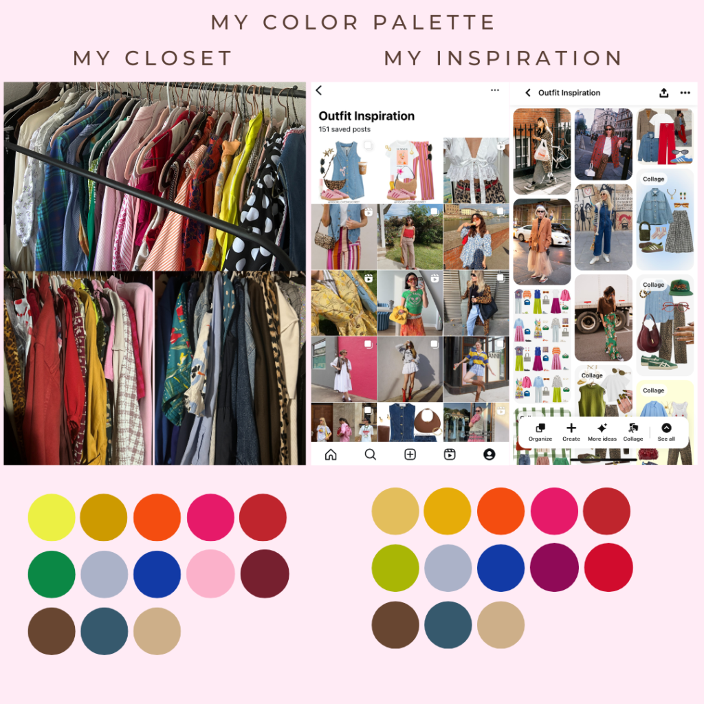
- Look inside your own closet. What colors do you have? For example, I have a lot of colors, but I clearly have a preference for red, green, blue, and pink. Blues and reds dominate most of my closet. It might help to take a picture like I did above.
- Do you lean more bright, muted, or pastel? It’s important because colors in the same family work well together. In my closet, I mostly have brights and jewel tones.
- What are you drawn to as inspiration? This is an easy way of seeing what color combinations you are drawn to the most. Check your Pinterest boards, Instagram saves, etc. Do they match what you already have? Or do you see some gaps you’d like to fill or combinations you’d like to try?
As you can see, my current and ideal palettes are pretty much matched up. There are very slight differences in certain colors, like green and pink, but I don’t feel that’s a big gap for me.
However, this has taken me years and a lot of trial and error. I know what I like, what I’m comfortable with, and what looks good on me.
As you can see, I also have quite a selection of neutrals, especially white and brown, which helps me create a balance in my closet. My personal style is colorful and experimental, so the amount of color makes sense to *me*.
Now, I know that jewel-toned palettes and bright, saturated palettes work best for my closet and my outfits.
Find out what works best for YOU and you’re most of the way there!
How to Create a Cohesive Color Palette in an Outfit: Tips, Tricks, & Hacks
Now, here’s a list of easy tips and tricks to learn how to create color palettes in your outfits every day.
- Prints are your best friends. If the colors are in a print, you know they go together. For example, if your blouse is orange but has a bright blue floral pattern, you can wear a bright blue accessory, bottom, or shoe to complement it.
- Accessories are a bridge. Accessories are like patterns in that they can create a bridge between seemingly disconnected items. A colorful bandana can connect your outfit in a subtle yet impactful way.
- Pinned palettes can be a guide. Try going to Pinterest or Instagram and looking for outfits based solely on the colors, independent of the items. Focus on the ones that have similar colors to what you have in your closet, and try using those combos with your own items.
- Planning is key. At least at first, planning what you want to wear ahead of time will save you a ton of time and doubt while getting dressed in the morning. I do this on Sundays: I plan my outfits for the week, thinking of items I want to wear, items I haven’t worn in a while, and how I can marry these items into one look.
How to Create a Color Palette Like a Pro: A Fashion Guide
Floral Prints, Easy – Outfit #1
As I mentioned above, prints are the easiest way to create a cohesive color palette for an outfit. One of the easiest patterns to start with is a floral print.
Floral prints tend to have more than one color besides the base color of the item and come in all color families. So, if you want to add a third color to accompany a neutral and a bright color, a floral pattern will have an answer.
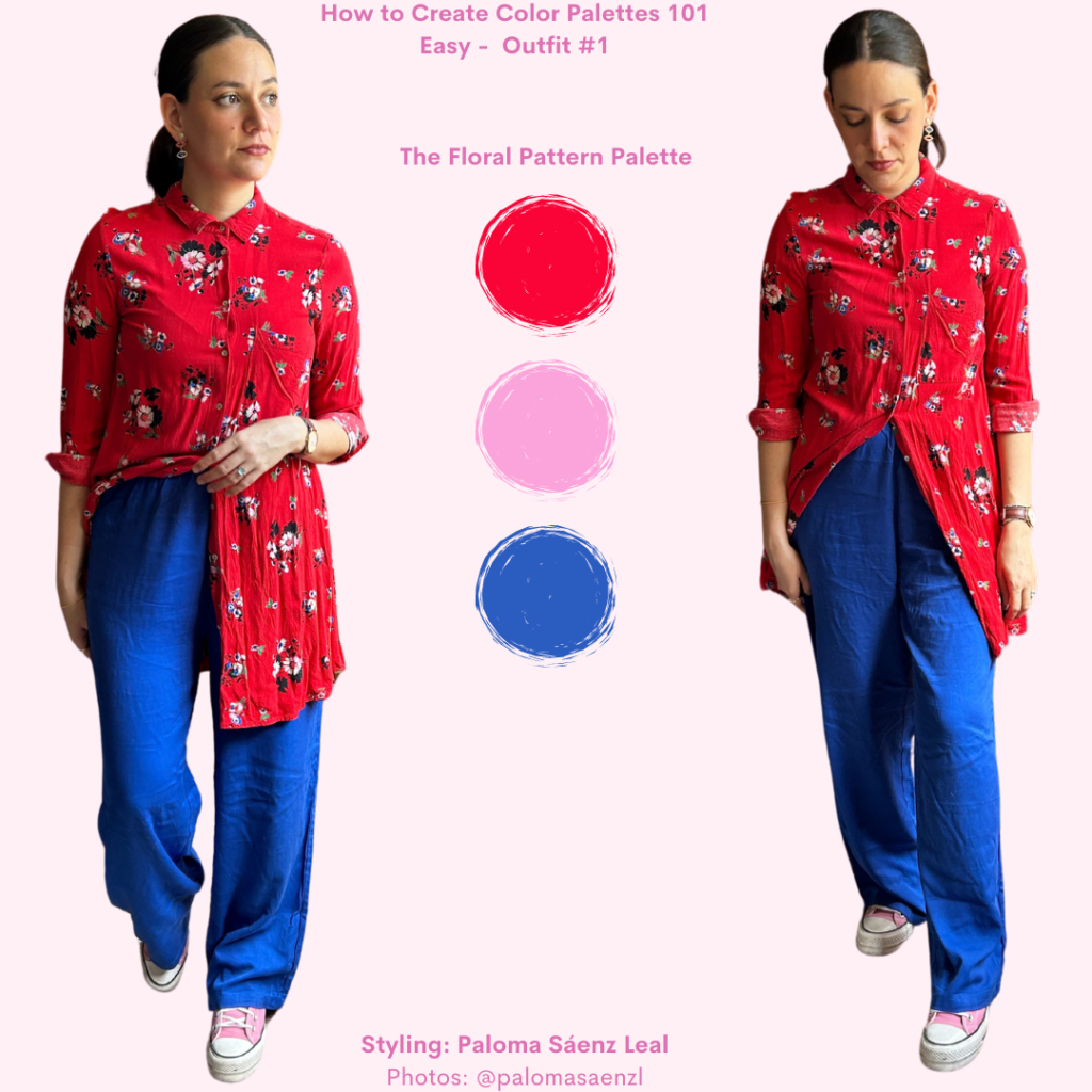
For my take on this, I started with this red floral mini dress and wore it as a shirt. The pattern has blue, green, and pink details. To keep it simple, I chose blue and pink to complement my look.
For my bottoms, I wore comfy cobalt blue pants. Then, for shoes, I put on bubblegum pink Converse. Finally, I accessorized with blue and pink earrings.
Unexpected color palette? Yes. But it works because the pattern has every single one of those colors in it. All the colors also belong to the same family: they’re bright, saturated colors, so they make sense together.
If I wanted to take this further and add a shade of green, I’d go for a bright or emerald green.
Graphic Prints, Easy – Outfit #2
Another great cheat sheet for a palette is a t-shirt with colorful graphics.
Just like floral patterns, graphics tend to have more than one color, and they are a quick way to know which colors go together.
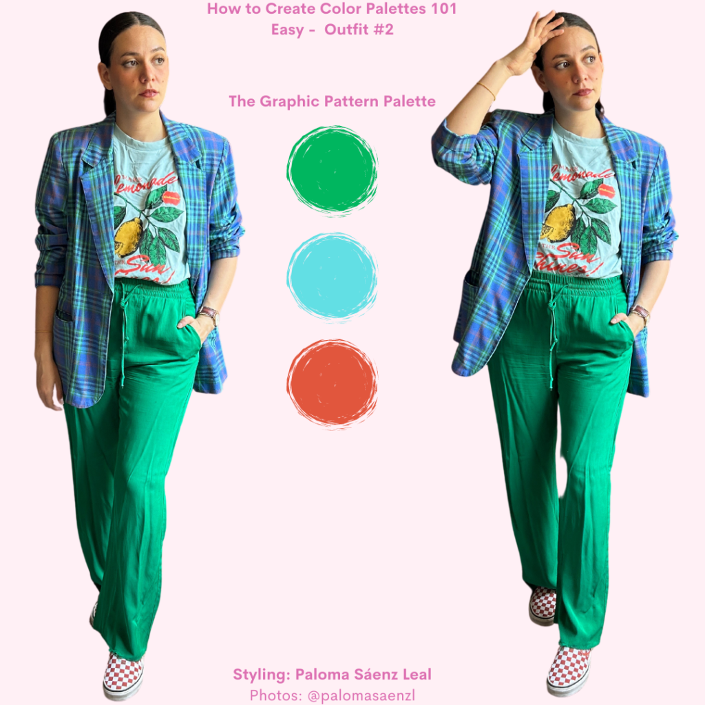
For my look, I chose two graphic items with similar palettes. The main one is this graphic T-shirt. It is light teal and has a green, orange, and yellow graphic.
To layer, I chose this tartan blazer, which has teal, orange, green, and blue. Both pieces have green in them, so I went for a pair of bright green pants.
Finally, for shoes, I chose a pair of orange Vans.
This palette has cool-toned blues and greens as main colors, with a slight accent color in a warm-toned orange. Both the blazer and t-shirt have the same palette, which helps them look good together in spite of the different patterns.
For the pants, I could’ve gone for an orange item, and it would’ve looked just as good as the green.
Accessories as a bridge, Medium – Outfit #3
What do you do when you don’t wear a patterned dress or shirt? What if you want to wear solid colors throughout your outfit?
The best way to make these items work together is to choose colors that are in the same family. But the easiest way to make these colors cohesive throughout one look is to add small details, A.K.A accessories, that will bridge the gap between pieces.
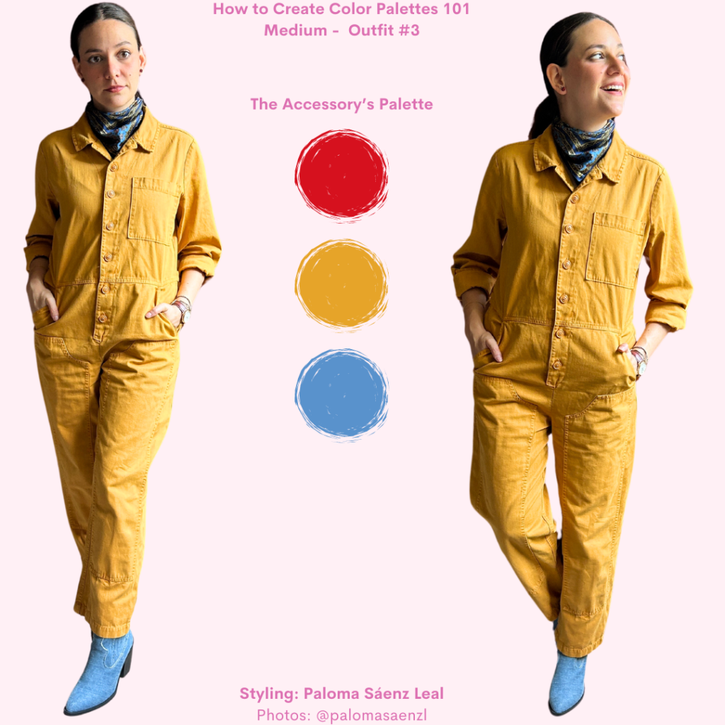
For example, look at this outfit I created. I’m wearing a mustard yellow denim jumpsuit. For shoes, I chose a pair of blue denim booties.
On their own, they don’t look bad because they are in the same family, but they need something to make them work better together. To keep it simple, I chose a blue and gold ascot to accessorize and match both the jumpsuit and shoes. The ascot also has very slight touches of red, so I finished with a red pair of earrings.
A small addition made all the difference. Does it help that the items are in the same family? Yes, but the ascot helps by echoing both, and it serves as a connecting line to the boots and earrings.
Shoes as a Bridge, Medium – Outfit #4
Shoes tend to have multiple colors and are easy to use as a bridge between solid-colored items.
Shoes can be great allies when they are multicolored. This is especially true for loafers and sneakers since they just add a little complementary detail and don’t take over the bottoms.
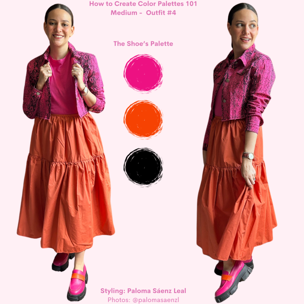
For my look, I started with a bright pink T-shirt. Then, I tucked it into an orange, tiered midi skirt. Then, I chose these fantastic pink and orange chunky loafers to bridge the gap between the tee and skirt. To finalize this look, and to also loop in the black sole of the shoes in, I layered with a bright pink snake print jacket.
This look is a great example of how even the soles of your shoes can help bring cohesion to a palette. Soles tend to be neutral, so they become a clue as to which neutral color you can add to your look.
Of course, I could have just added a pair of pink or orange sneakers, but these loafers helped the outfit to be more cohesive, especially with the pink and black jacket.
Pinned Palettes, Difficult – Outfit #5
The best place to find new color palettes to try out is probably Pinterest. We usually go to it to find ways to wear certain items, but you can do that with color, too.
Just browse your inspiration board or feed and ask yourself, what color palettes are you drawn to? You don’t have to like the outfit in itself, or have those specific items in that specific color, you just have to like the colors together.
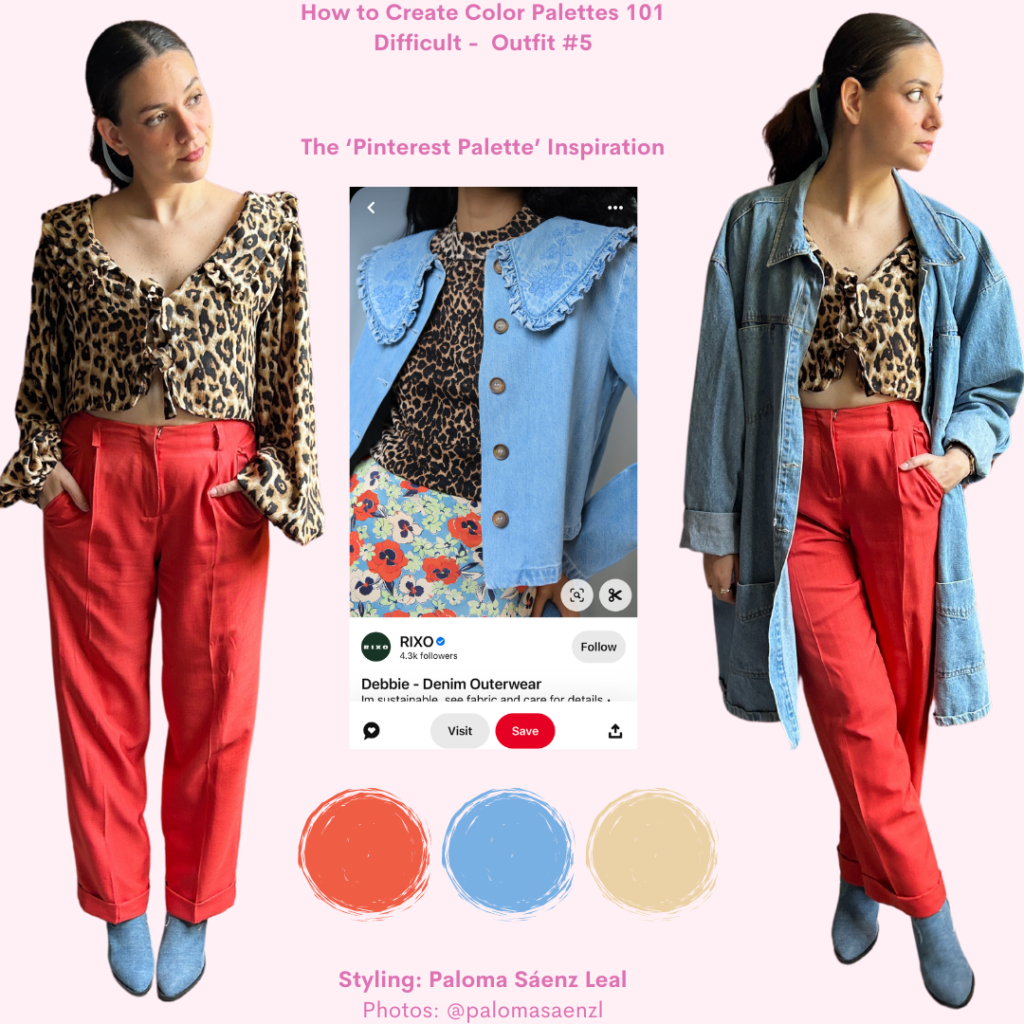
For this example, I got inspired by this specific pin on my board. The prints and items are right up my alley, but I don’t have dupes for them, which is fine. What I loved most was the color combination.
First, I put on a pair of bright orange trousers. Then, I used an animal print tie-in blouse. To add the blue, I wore the blue denim booties from the third look. Then, to bring in a bit more of the denim, I threw on a denim coat. Finally, to add the blue from the floral print, I accessorized it with a sky-blue ribbon.
I really loved how this outfit turned out. I had never even thought of wearing any of these items together until I saw that specific pin. Pinterest is a great way to find unexpected color pairings within your own closet.
Pinned Palettes, Difficult – Outfit #6
Instagram is also a great place to find inspiration for color palettes.
Personally, I’m still more of a Pinterest girly, but Instagram is right there, and we all curate our feeds by following people and pages that cater to our tastes. Especially if you follow fashion brands.
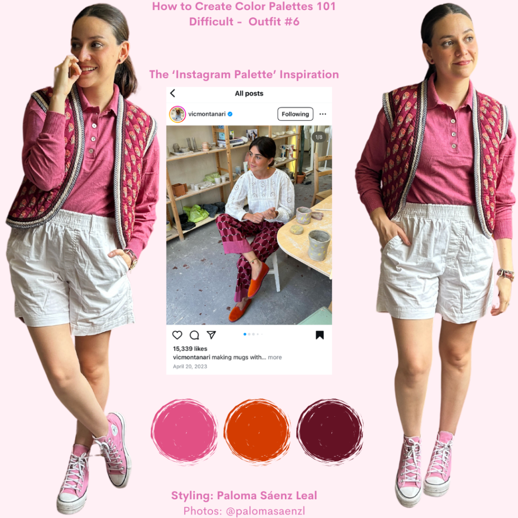
So, for my Instagram inspiration look, I chose this image. While I love Vic’s outfits, I follow her specifically because my taste in colors matches hers, not necessarily because we have the same style.
To recreate this palette, I chose a berry pink knit polo top and paired it with white shorts. Then, I layered on a burgundy and brick orange floral vest. Finally, to add the pink, I wore a pair of bubblegum pink Converse.
None of the items match hers, except when it comes to color. Again, I had never thought of pairing that specific vest, top, and sneakers together until I saw that image and remembered I had all those colors in my closet.
I loved this look, especially because I hadn’t worn that shirt in a while and had wanted to use it more. Now, I’m thinking of other burgundy or brick-orange items I can pair with it.
Final Thoughts
Honestly, creating a cohesive color palette can be so satisfying, but we’re not always with the headspace to bring out our color wheel and put something together. It’s well worth the effort, though!
Finding easy tricks to pair different colors and making my neutrals work in service of a bright-colored outfit has been so refreshing. I can see my items and my outfits in a new light, and it has helped me wear those items I have trouble bringing into my daily rotation.
Looking for color inspiration is easy. I used actual outfits as inspiration in this post, but your color inspo doesn’t even have to be the image of an outfit. It could be home décor, art, aesthetic images, or wallpapers.
Color surrounds us, so take advantage of that experiment with what you already have to see what works for you.
What Do You Think?
Would you wear any of the outfits? What’s your favorite color palette? Do you have any styling questions? Let us know in the comments below!